Herd Network is a service that helps people maintain their mobility in times of crisis. It connects those in need to other members of their community who can provide help and resources.
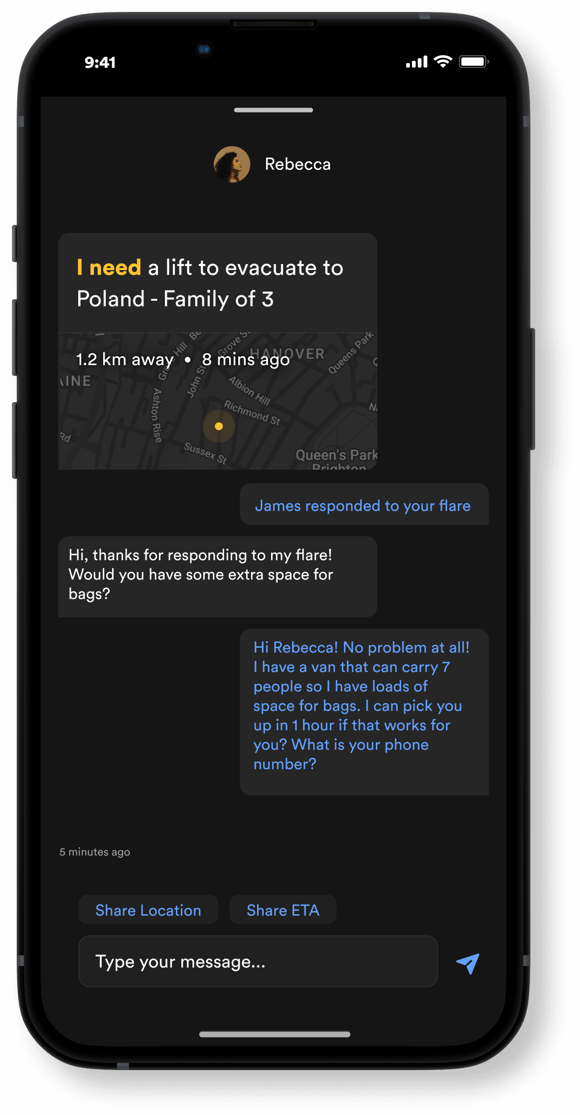
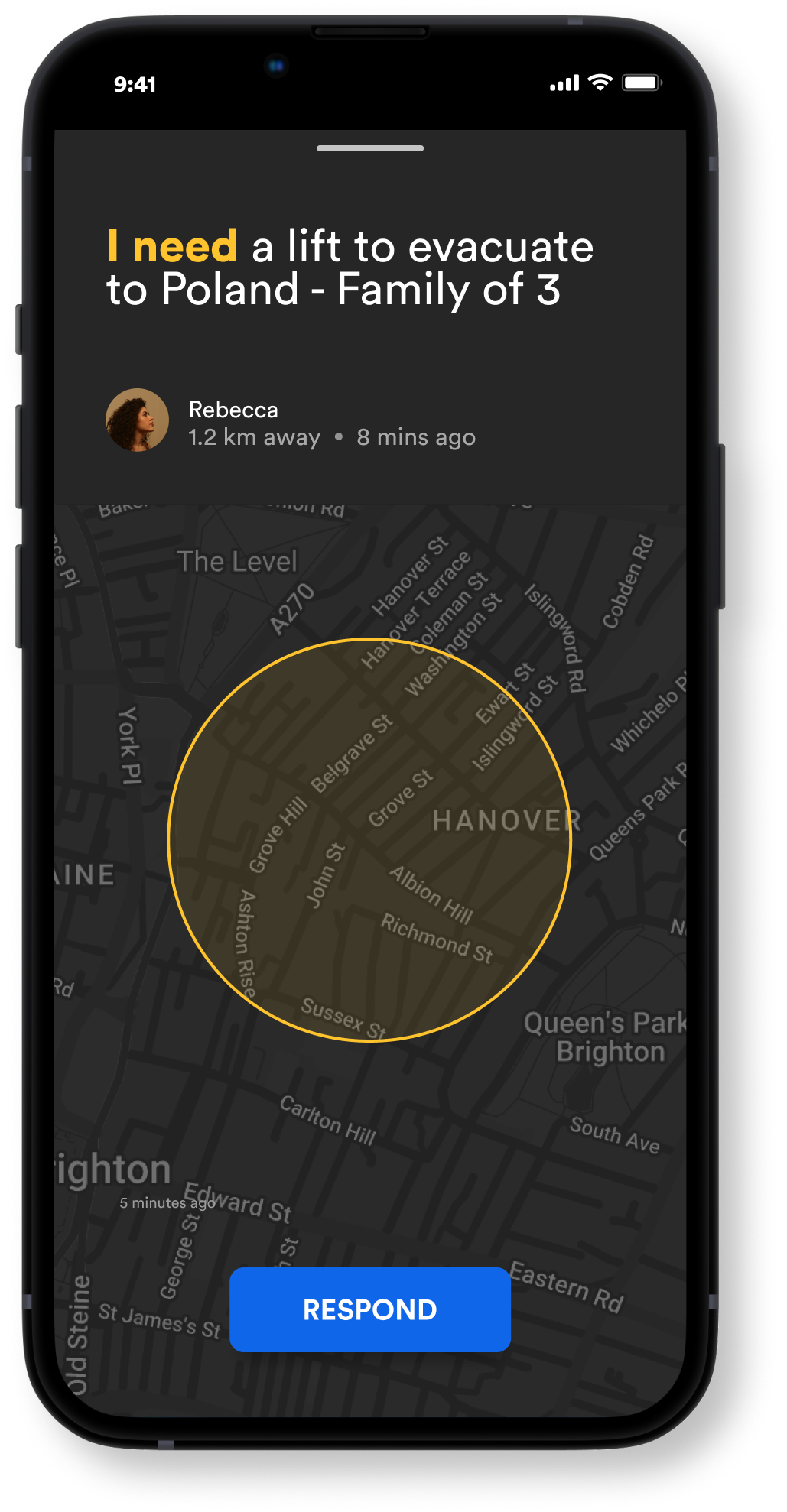
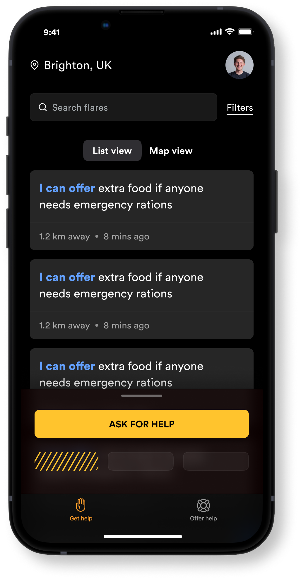
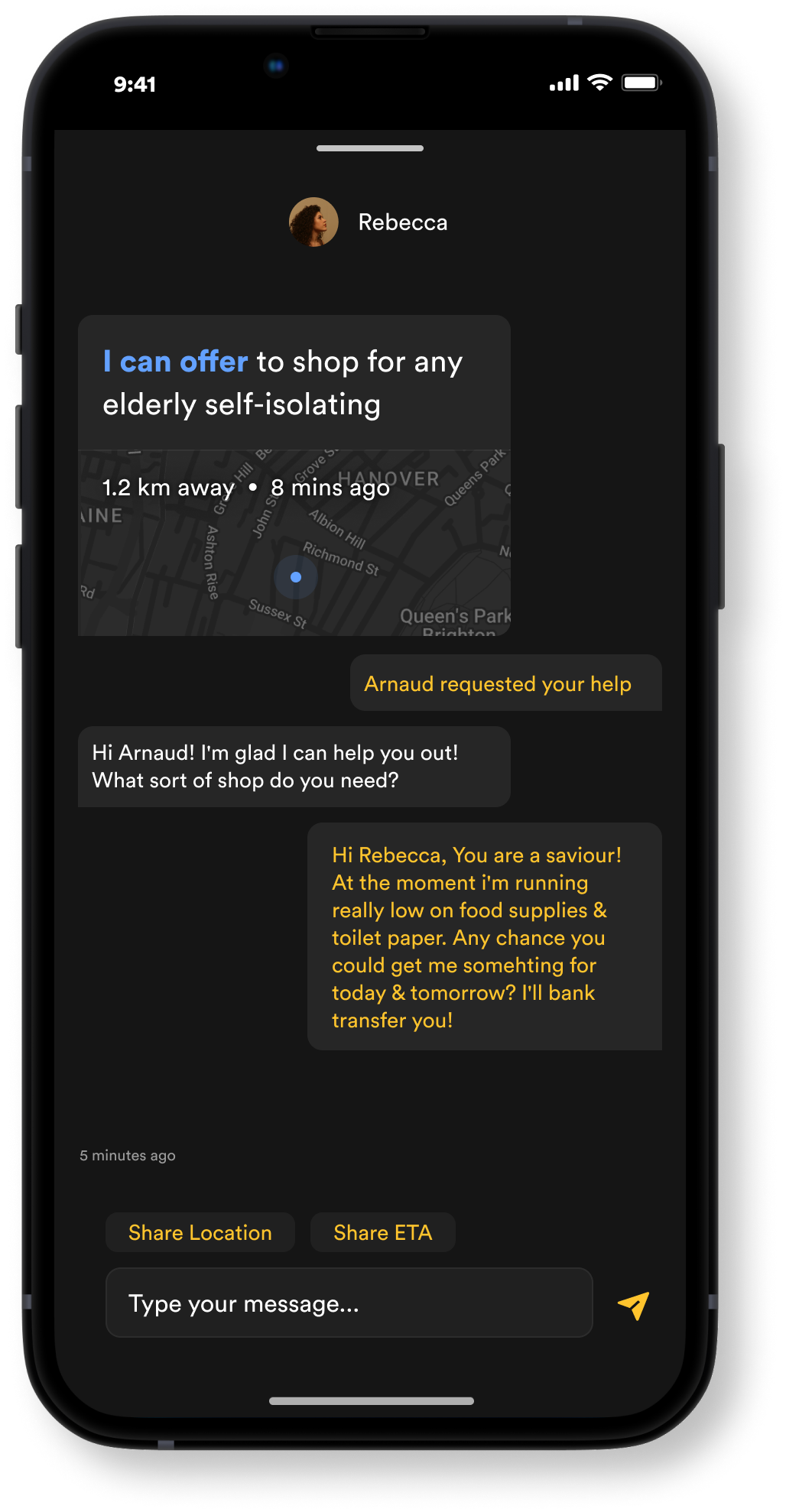
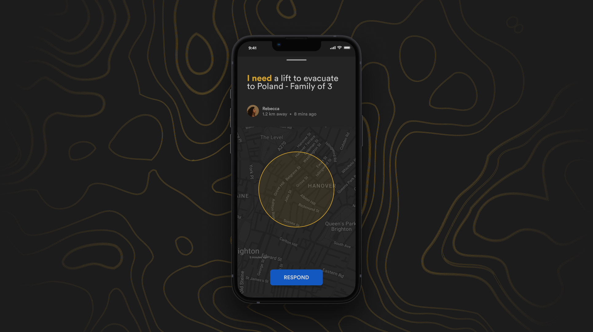
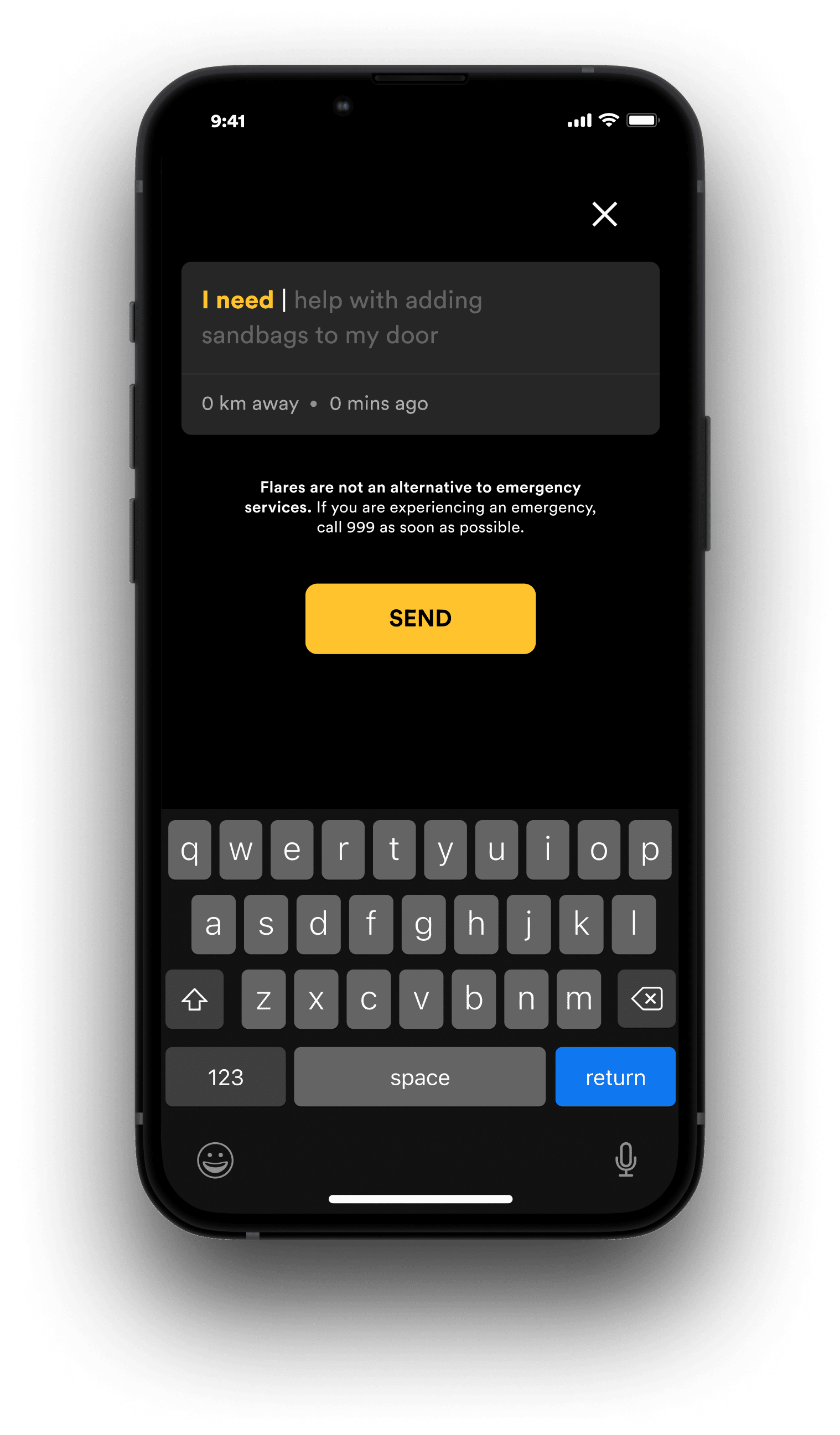
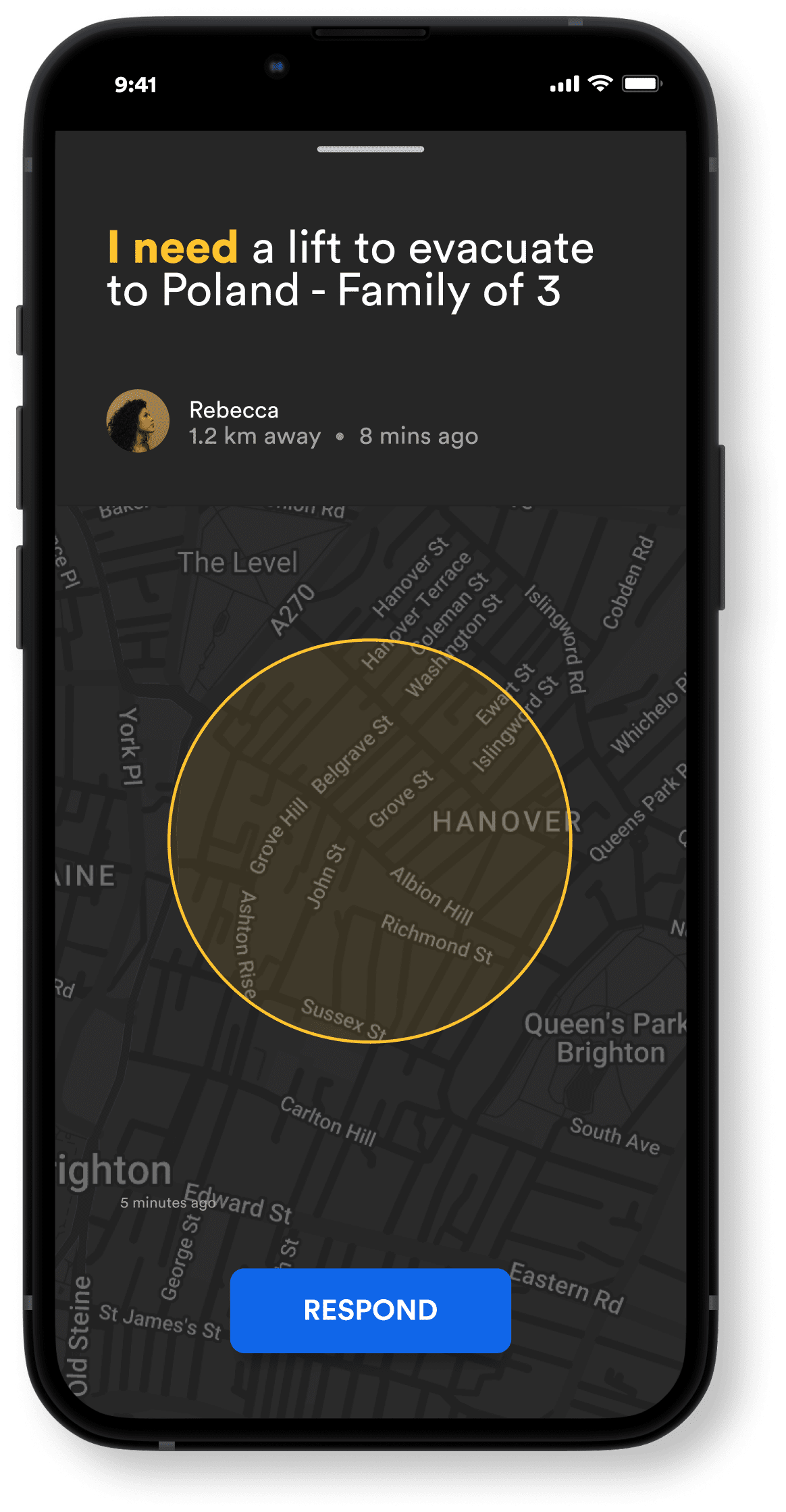
Users in need simply send out a ‘flare’ from their mobile device, and those who can help, respond to these flares, enabling the natural instinct we have to help one another in time of crisis.
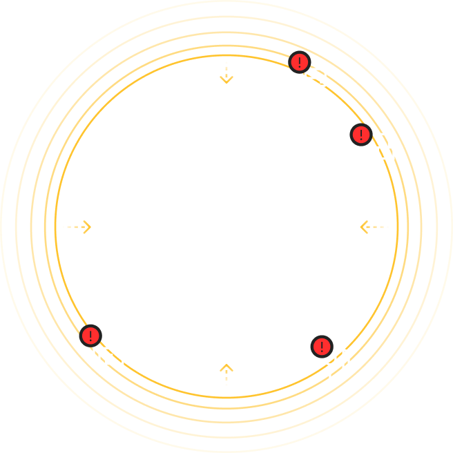
Send flares when in need of help
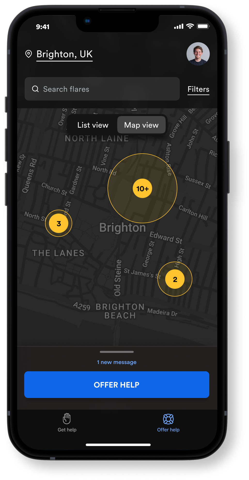
Act on flares to support those in need
Features
MVP SCOPE
The Golden Moment
The period of time when self-help is most crucial
Use real-time data to warn users
Recommend actions in line with a flood timeline
Present new options for mobility as the flood evolves
Sending a Flare
A rapid request for assistance
Allows users to communicate their individual needs to the wider community
Facilitate immediate response based on priority
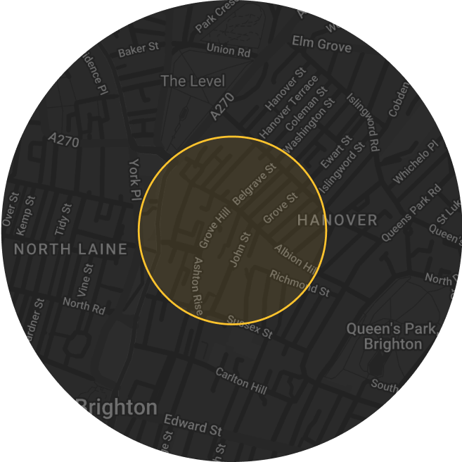
Resource Distribution
Improving the mobility of necessary items.
Maintain a database of local resource information
Build a request-based system
Establish supply chains optimised for flooding conditions
Resource Distribution
Improving the mobility of necessary items.
Maintain a database of local resource information
Build a request-based system
Establish supply chains optimised for flooding conditions
Principles
Intuition over fluency
This service is likely to be used most often by people new to it or who haven’t used it in a while, so the design should cater to beginners rather than power users.
Ways to implement
Actions are discoverable
Fewer interactions
Transferable mental models
Scalable metaphors
Momentum, not thought
This service is likely to be used most often by people new to it or who haven’t used it in a while, so the interface must make action as simple and easy as possible.
Ways to implement
Always suggest
Flare everywhere
Don't overwhelm
Remove action friction
Build habits
Social over personal
Primarily being a social service, the user must be encouraged to act in a social way.
Ways to implement
Reinforce social choices
Encourage sharing
Maintain internal social rewards (Such as feeling pride by publicly volunteering).
Flare Development
Felt old, visually cluttering the screen when stacked with multiple. Too much text.
Simplified visual design & attempt to communicate category through colour
Realising the importance of the flare itself is the message. Thus we increased its prominence and decreased the hierarchy of category & location info. Introduced the idea of significantly limiting character count to 50.
Reducing the colour as it was too overwhelming when stacked. Giving some more breathing space within the flare.
Further simplifying the visuals. Exploring a lighter font thickness & introducing ‘time sent’ & exploring the idea of sub-categories and how this might be communicated.
Removal of colour as a communicator as we felt it was hard for users to associate colour with unfamiliar categories, as well as it overwhelming the list view.
Settling for the most minimal but balanced option that can be comfortably presented in a list view on multiple devices.
User flows
Avoidable risk to mobility is predicted product guides user actions
This journey tackles common barriers to mobility in a crisis, namely confusion and lack of awareness of risk. The personalised warning ensures users respond, and the ensuing actions keep them able to prepare for the flood calmly.
User lacks a resource, product helps communicate need to wider community
This journey pieces together how a user could alert the community to their need, and how the product can maintain their mental state as they wait. In the instance of the flare receiving no response, further options are explored.
User wants to help, product enables this
In this journey, those who want to help are encouraged to identify the ways in which they may be able to and add them to a database. From this point, the product uses an algorithm to match those who want to help those in need.